Rebranding The NYC’s Largest E-bike Retailer
Defined the brandvoice and structure, positioning FLYE as ‘Your Local E-Bike Expert’
Built a consistent brand system across physical, digital, and marketing touchpoints
Streamlined brand execution to support the company’s post-IPO expansion
TIME
Feb 2025 ~ May 2025
My Role
Brand Positioning Brand Strategy Visual Identity Design Create Design Guidelines End-to-End Rebranding Execution Trademark Registration Support
Cross-Collaboration
CEO Marketing Product Operation Legal
[ Context & Challenge ]
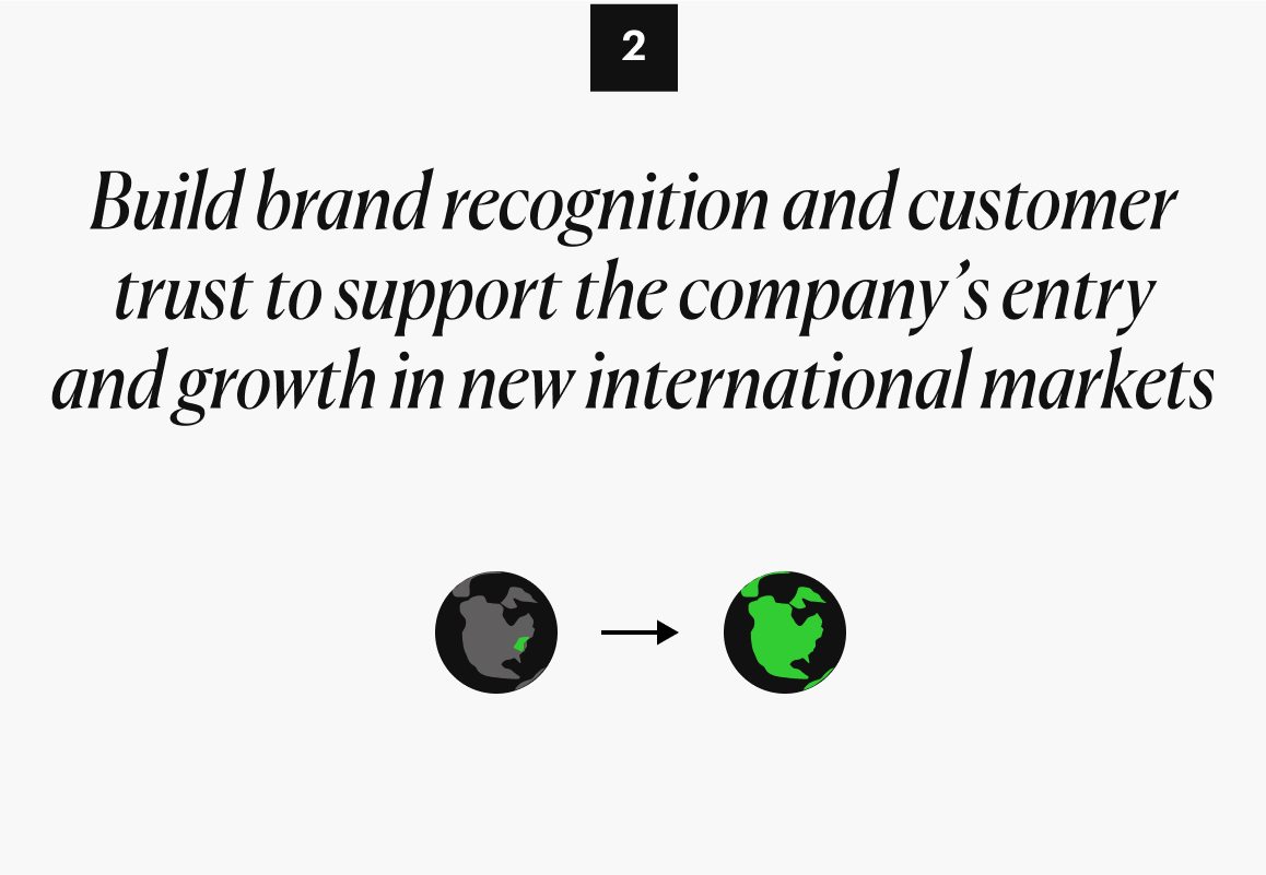
From NYC To The Worldwide Market
Founded in 2018, Fly E-Bike grew into New York’s largest electric bike retailer and was listed on NASDAQ in 2024.
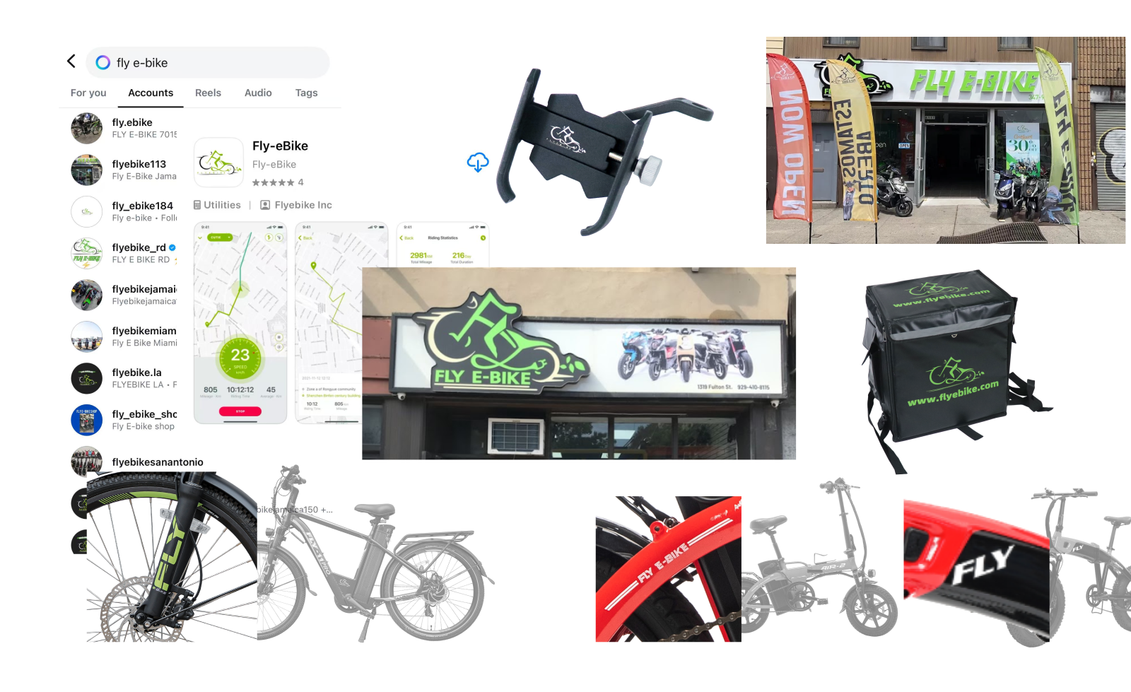
The Creative “Entropy”
Rapid expansion led to inconsistent visuals and fragmented logo usage across customer touchpoints. The company needed a unified brand identity to support its rapid global expansion.
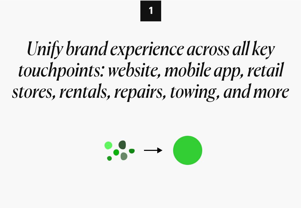
[ Rebranding Goal ]
[ Logo Redesign ]
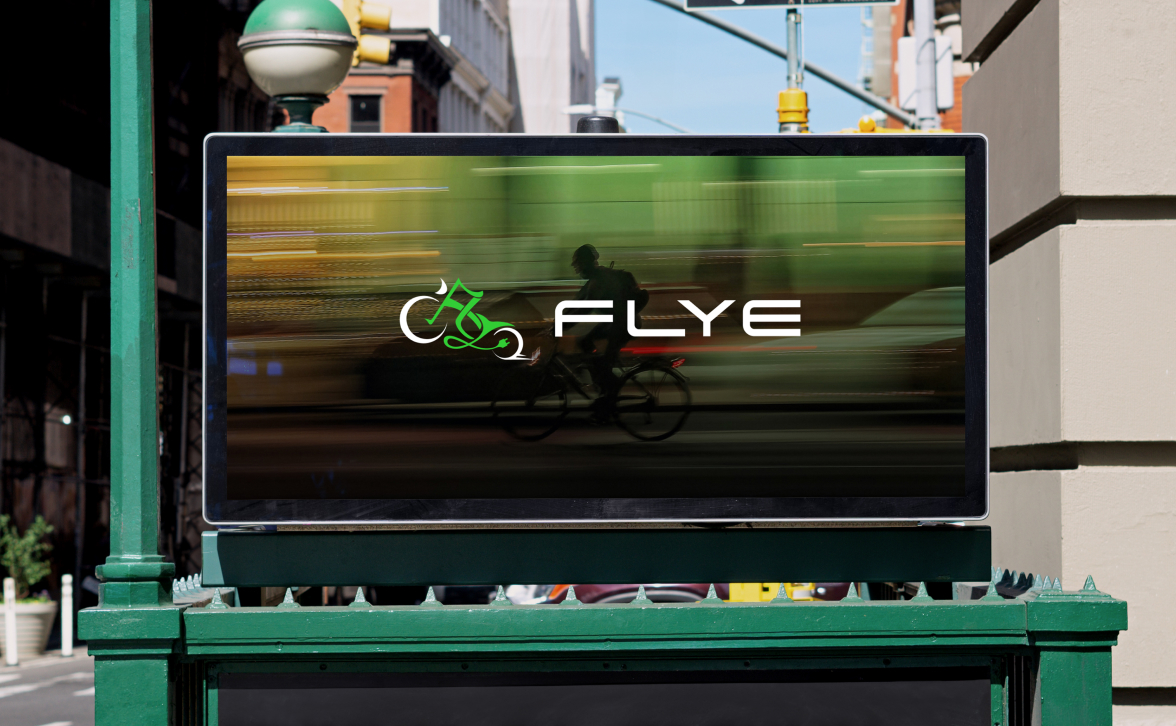
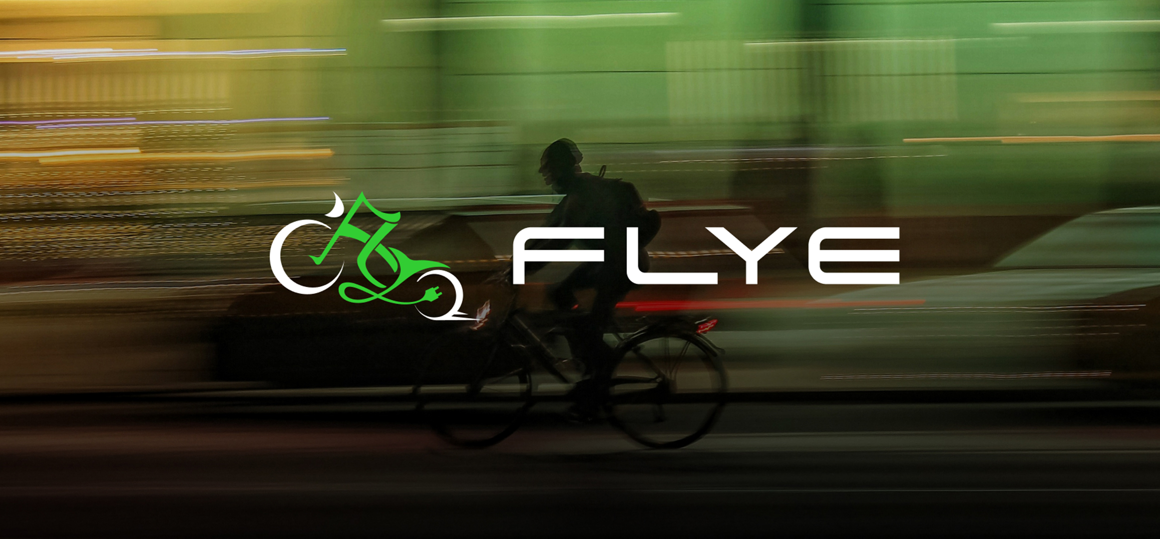
A Visual Link Between Heritage and Growth
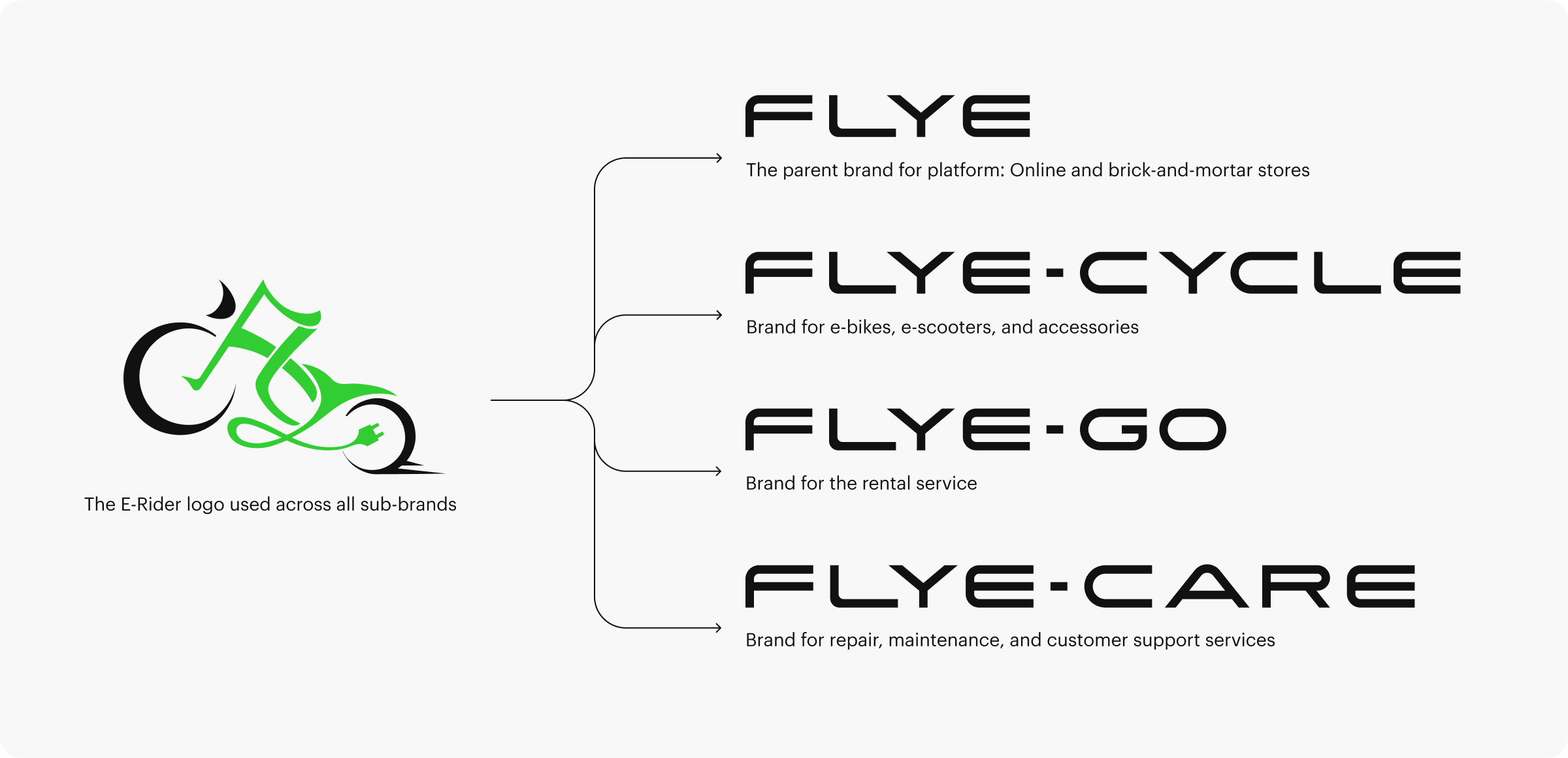
Since the brand’s inception, the “E-Rider” icon—an abstract electric rider on a bike—had been in use and had built significant recognition as the most distinctive brand asset. We chose to retain and refine it rather than start from scratch. The goal was to preserve existing brand equity while improving clarity, scalability, and setting the foundation for the new identity system.
[ Brand Strategy ]
Laying the Foundation: Naming, Structure, and Voice
Since the previous brand name, Fly E-Bike, could not be successfully registered after five years of use, this rebranding required a name change.
In response, I developed a new brand naming system that retained the equity of the original name, improved user recognition, and ensured successful trademark registration.
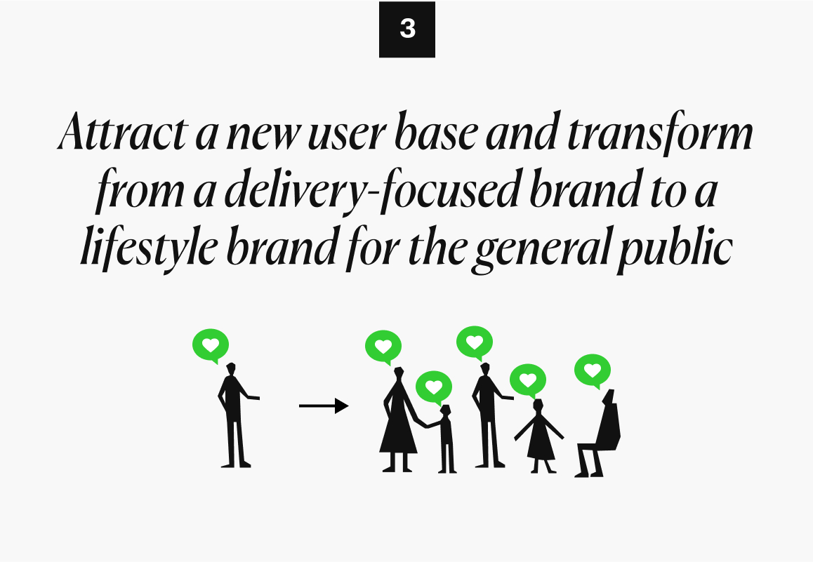
Establish a clearer position in the customer’s mind: “Your Local E-Bike Expert”
Research showed the need for a stronger, more relatable positioning. “Your Local E-Bike Expert” was created to reflect both brand expertise and its community roots.

Introduce a new visual element — the store Signs
The store logo reinforces the brand positioning while accommodating the operational differences across different location.

[ Brand Guidelines ]
I created a practical brand guideline covering logo use, colors, signage materials, tone of voice, icons, and photography style—making it easier for all teams to apply the brand consistently across environments.
[ Brand Expression Across Touchpoints ]